Data Visualization
To access this functionality, Open the "Explore" Menu in the left panel and choose the "Data Viz" submenu.
HyperCube includes a data visualization feature, which allows you to visualize how variables are related. To create a new data visualization just click on the "+ VISUALIZATION" on the top right side. You can choose the chart by clicking on the tab, then enter the "Name" of your analysis, the "X and Y axis variable" you want to analyze. Some of these charts also offer you the possibility to cross-analyze two variables depending on your target. Finally, click on the "Create" button to generate the graph.
Square Binning
The Square Binning representation offers you the possibility to cross-analyze two variables. Once you choose the two variables then click on "Update" button. As illustrated below, the chart will appear on the right side with its corresponding legend. By default, the legend color gradient is evaluated from the extreme size values of the chart (i.e. 0 and 448). With the mouse, you can change the color gradient to adjust your chart. In the example, the default legend gradient allows to see only four "Gender" modalities, those with large size values. After adjusting the gradient color, the small size "Gender" modality appears.
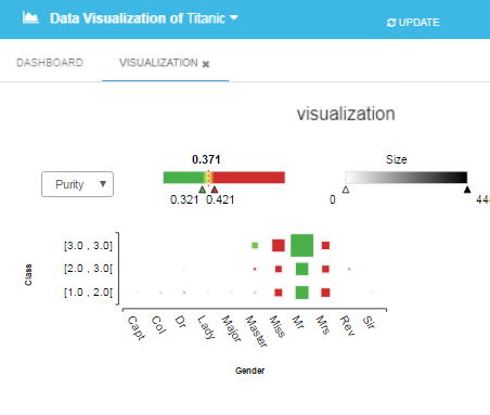
You can also choose a cross-analysis depending on a selected target. The example illustrated below still represents the "Gender" modality as a function of the "Class" and depends on the target Survival Status-Alive. The size of each square is depending on the size of the subgroup ("2-3 class" and "Mr." = 448) and the color is depending on the purity of each subgroup.
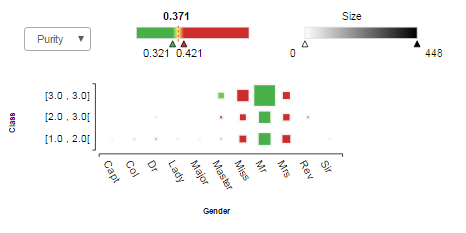
- The size corresponds to the number of elements in each modality.
- The purity of a modality corresponds to the ratio between the number of element satisfying the target criterion and the size of the modality.
Tree Map
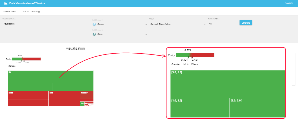
The Tree Map view represents the purity value of your modalities as rectangles. The surface of each rectangle depends on the size of the corresponding modality. Tree Map visualization allows you to evaluate:
- Firstly, the size and purity of each 1st variable modality (cf. graph below: the size of "Mr." is 759 and the purity is 0.17)
- Secondly, by clicking on a 1st variable modality, a new graph appears representing the repartition of the different modalities of the 2nd variable into the 1st selected variable modality. (cf. graph below: the size of the "Mr." in the 2-3 "Class" is 448, and the purity is 0.141)
- Finally, the color represents Purity of each group you are looking at. You can also adjust the color gradient legend to better visualize your datasets.
Sankey Chart
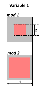
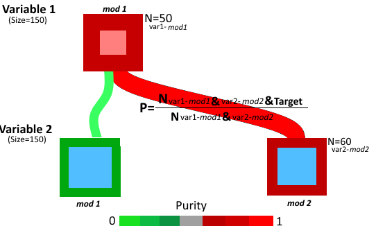
Sankey Chart allows you to understand the interactions between the modalities of different variables. The modalities of one variable are represented by squares with the same size (as indicated by the "arrow 1"). For each square (modality), the color of the inside square (e.g. pink here) indicate the variable and its size is proportional to the number of observations for each modality ("arrow 2"). In the scheme on the right, Variable 1 has two modalities with the size of modality mod 1 smaller than the one of modality mod 2.
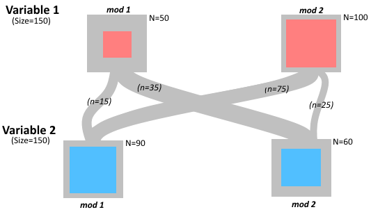
In the first step, you can see the Sankey Chart as a representation of the repartition between the modalities of each variable. As illustrated below the interaction between two variables, each of them having two modalities. The lines connecting the modalities represent the flux between the modalities of each variable. The line thickness is proportional to the repartition of the elements between each modality of the two variables.
In the second step, the purity of each modality is added on the chart. Following the scheme annotations in, the purity of the modality mod1 of Variable 1 is evaluated from the number of events in the modality 1 that satisfy the Target condition (Nvar1-mod1&Target) divided by the total size of the modality (N=Nvar1-mod1). This purity is represented by the color of the square edges.
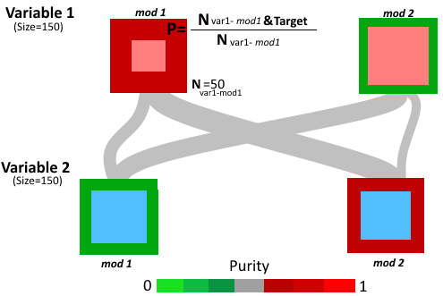
Finally, the purity of fluxes between the modalities is also evaluated. For instance, the purity of the flux between the Variable 1 mod1 and Variable 2 mod2 corresponds to the ratio between the number of events that (i) belong to both linked modalities and (ii) satisfy the selected Target condition (Nvar1-mod1& var1-mod2&Target) and the total number of events satisfying both modalities (Nvar1-mod1& var1-mod2).
With HyperCube you can choose up to four variables to build the Sankey Chart. By clicking on the different modalities, you highlight the direct fluxes between the different variable modalities. As illustrated below, the case of a Sankey Chart build from three variables, each of them having two modalities. By first selecting the modality "older than 40year" (1) you can see how this modality distribute between "Female" and "Male". Then, you can choose "Female" (2) to see its distribution within the variable "Class".
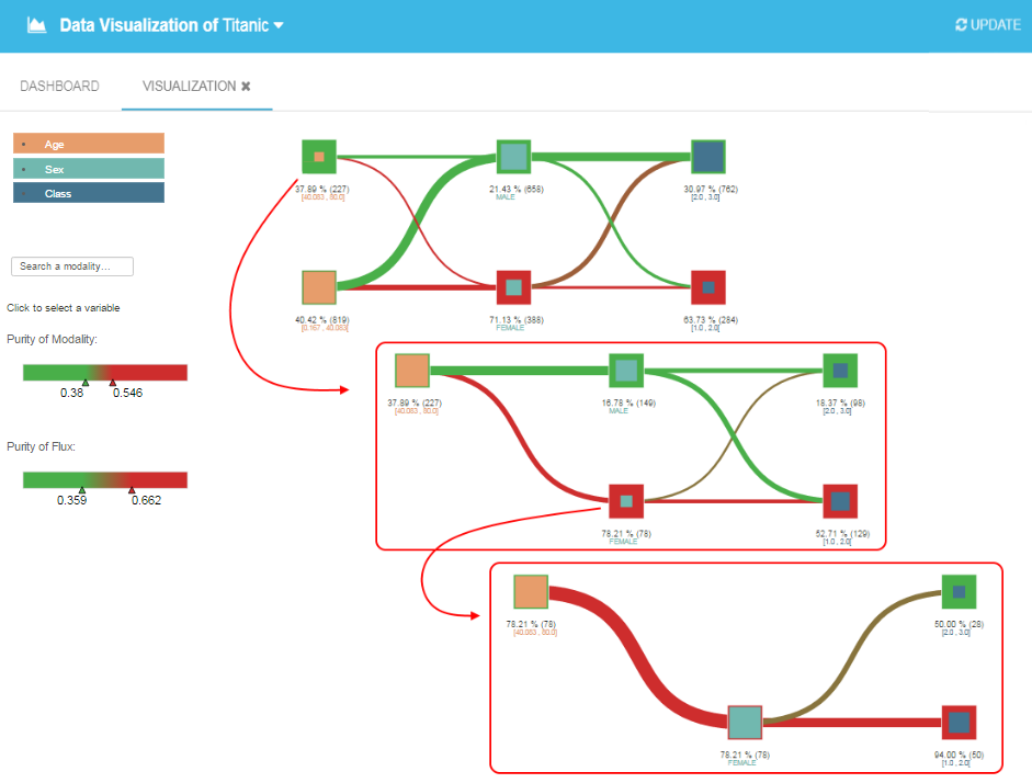
Note that: "Max Number of Modality" allows to only use a small number of modalities for discrete variables to keep the chart easy to read.
Bubble Chart
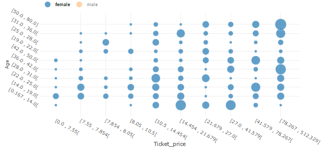
The Bubble Chart allows you to represent three variables at the same time. Firstly, you choose two variables you want to cross-analyze, and a third one - a discrete variable - to group the elements by the third variables modalities. For instance, you can choose variables "Age" and "Ticket price" and group them by their "Sex" modalities ("Female" vs "Male"). The size of the circle is linked to the size of each subgroup and the colors indicate the 3rd variable modalities.
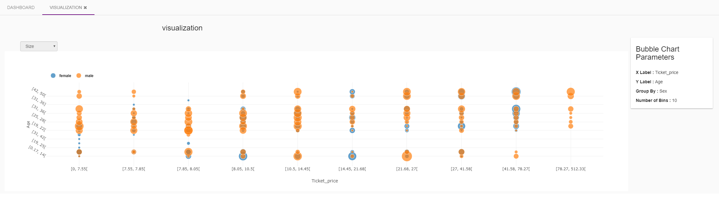
To make the interpretation of the Bubble Chart easier, you can mask the different modalities of the 3rd variable by clicking on them. Move the mouse over the circles to obtain information on each subgroup.
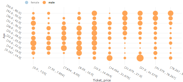
Finally, if you choose to represent your dataset depending on your Target, you can choose a representation by size or coverage of each subgroup with the dropdown menu.
Note: we recommend you to use 3rd variable with less than 5 modalities to have a readable Bubble chart.
Bar Chart
The Bar Chart allows to visualize one variable depending on the modalities of a second variable. By default, the number of bins is fixed at ten but you can change it. The chart below, represents the variable "Age" with regard to the 3 modalities of the variable "Class" into 5 bins. As for Bubble Chart, you can mask the different modalities to make the chart easier to read by directly clicking on it in the legend part.
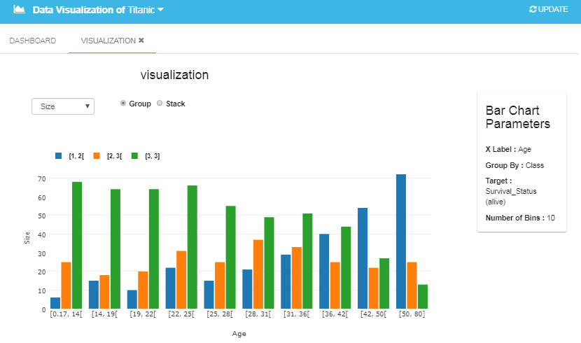
Finally, if you choose a Target, the dropdown menu offers you the possibility to represent the datasets as a function of its purity or its coverage regarding the selected target.
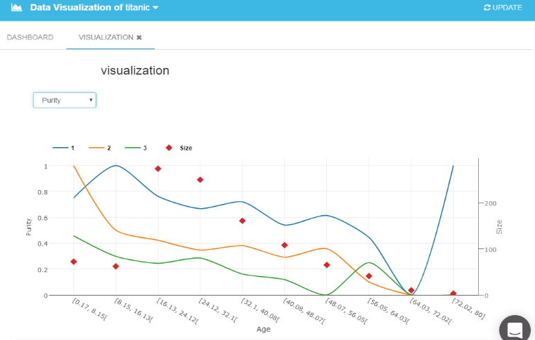
Line Chart
The last data visualization in HyperCube is a Line Chart. Compared to Bar Chart, Line Chart allows you to visualize continuous variables only depending on the modalities of the second variable. As for Bar Chart, you can choose the number of bins (by default bin=10), and you can mask the different modalities by directly clicking on it in the legend part. If you select a Target, the dropdown menu allows you to represents the variable as a function of its purity or its coverage regarding the selected target.